Project

Overview
Instagram Reels have become a powerhouse of engagement, storytelling, and creativity. However, as users and creators stretch the format for episodic content, one issue remains consistently frustrating: finding the next part of a multi-part Reel series.
This case study unpacks a real-world pain point I encountered firsthand as a user, investigates its impact across the community, and proposes thoughtful design solutions to create a more seamless and satisfying experience for both viewers and creators.
Why it matters?
Multi-part Reels are a growing content format on Instagram, often used for storytelling, tutorials, or cliffhangers.
The current discovery mechanism lacks continuity. There’s no seamless path to follow parts in order.
Users are left feeling cheated, confused, or forced to manually scroll through a chaotic profile grid.
The problem
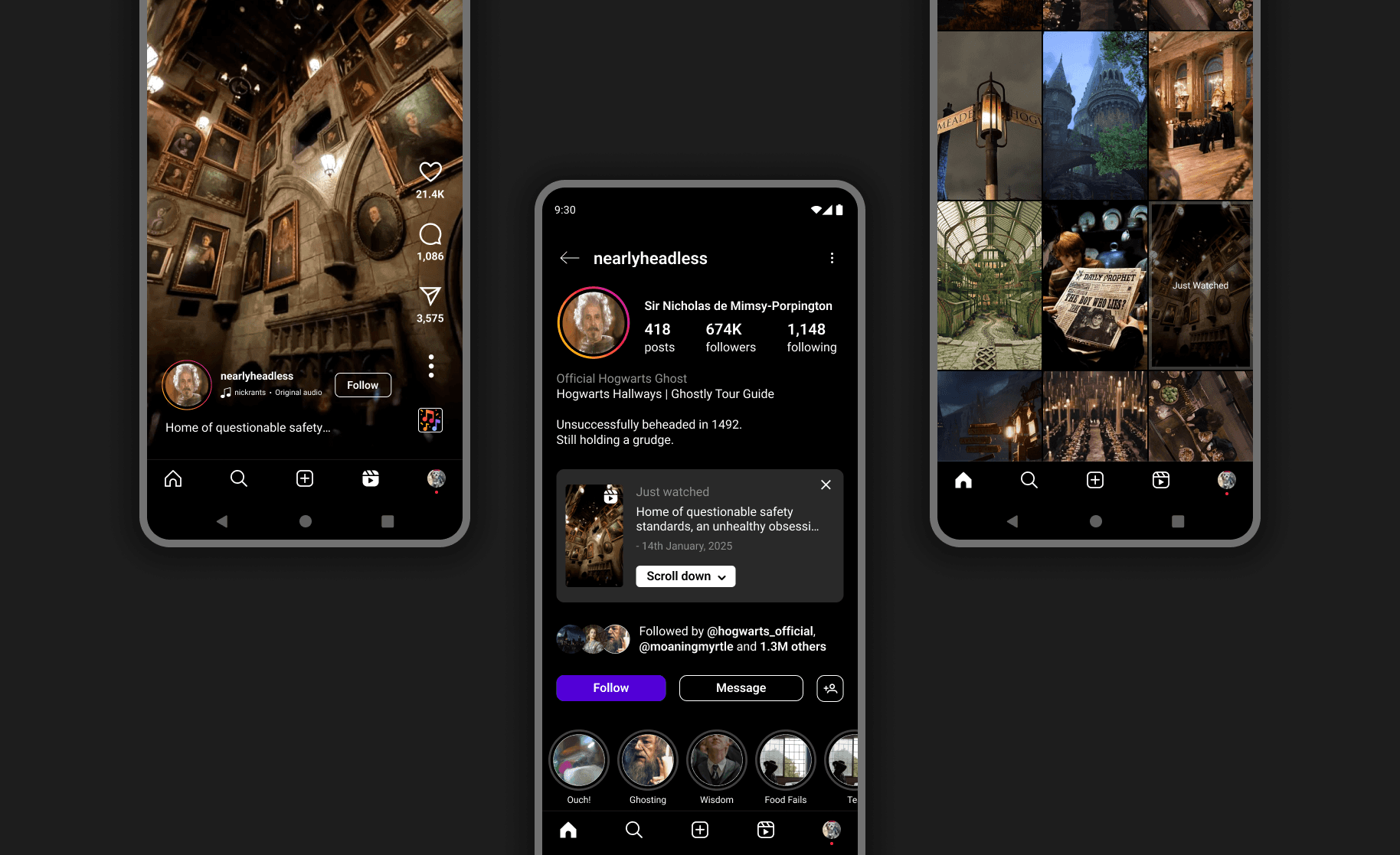
Imagine watching an intense cliffhanger on Instagram Reels. The moment builds—and just as it reaches its peak, it ends with: “Part 2 on my profile!” You tap the creator’s profile, scroll past dozens of unrelated videos, and… nothing. Part 2 seems to have disappeared into the algorithm.
Key Friction Points:
No clear indication that a Reel is part of a multi-part series.
Users must manually scroll through a disorganized grid of Reels.
The “Just Watched” label on profiles is too subtle and easily overlooked.
The viewing experience feels interrupted, disjointed, and frustrating.

Research approach
Discovery through frustration
This investigation began organically—while mindlessly scrolling through Reels myself. After getting caught in the cycle of trying to find “Part 2,” I paused and asked those around me:
“Have you ever struggled to find the next part of a Reel?”
The answer, universally, was yes.
Guerrilla Interviews
I conducted casual interviews with 7 Instagram users aged 18–28. Each had faced the same problem:
Difficulty locating follow-up content.
Loss of interest after failed attempts.
General annoyance at how unstructured the experience felt.
Online sentiment analysis
I extended my research to Reddit and Twitter/X, reviewing user threads and complaints.
Recurring themes included:
“Creators should be able to link parts.”
“The profile grid is chaotic.”
“I just give up if I can’t find it within seconds.”


Insight
While some creators may exploit this gap for engagement, most users experience this disjointed flow as a design failure, not a feature. In reality, both viewers and creators are hindered by the lack of native support for episodic storytelling.
Design goals
Based on the insights from research, I established three key goals:

Proposed solution
Introduce a “Go to Just Watched Reel” button at the top of the creator’s profile that highlights and scrolls directly to the last-viewed Reel.
Enhancements
Increased visibility of the “Just Watched” label.
Minimal UI intervention—keeps the profile layout familiar.
Immediate context recall for users revisiting a profile.
Viewer's flow

Linking of reels by the creator
Outcome
Reduces friction when finding a Reel on the profile.
Encourages deeper engagement with creator content.
Keeps the Instagram UI familiar, only adding a small but impactful improvement.
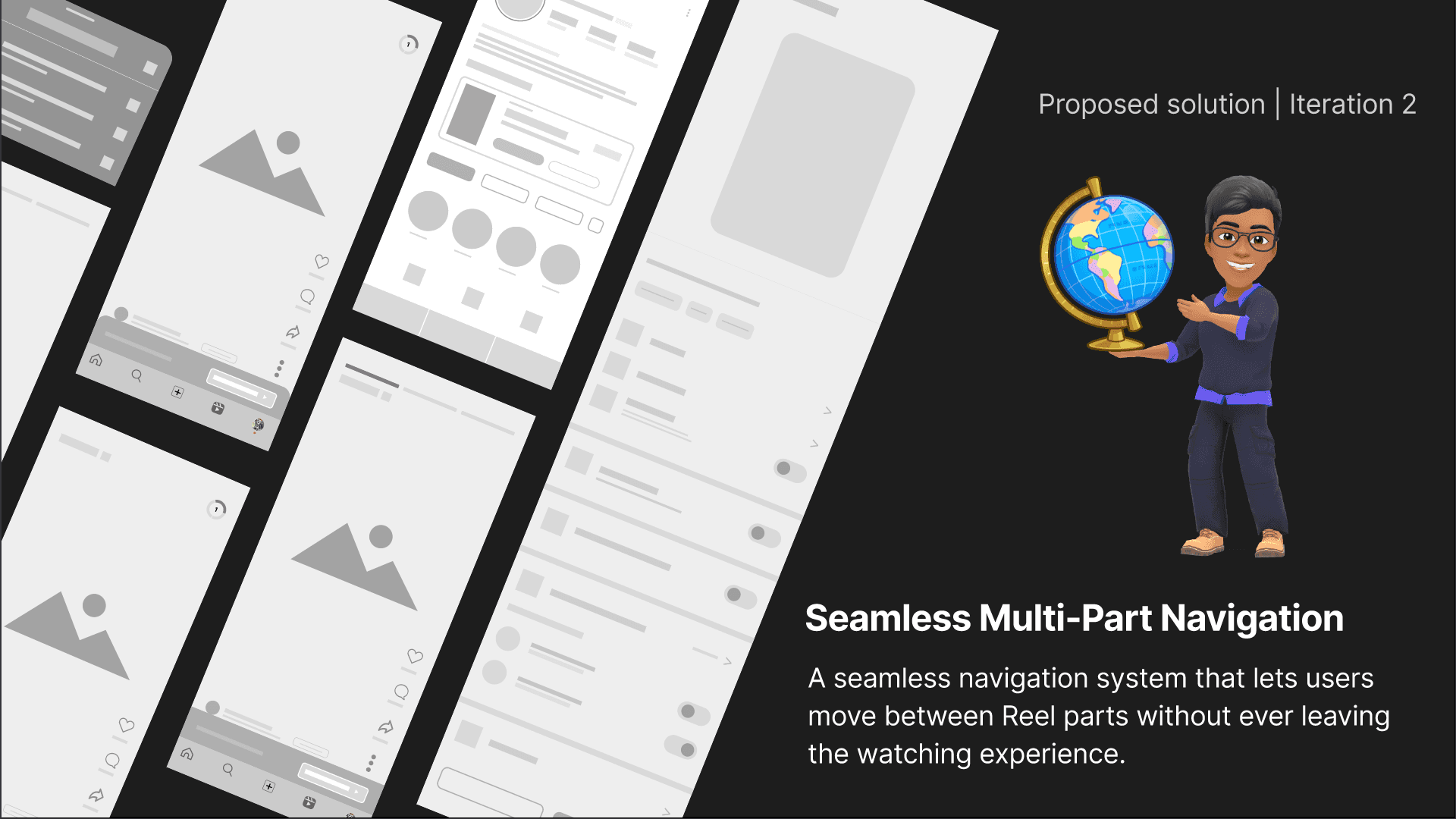
Proposed solution
Enable users to seamlessly discover, track, and navigate multi-part Reels—without ever leaving the viewer.
This means bringing the series navigation into the Reel itself, with intuitive, native design patterns that don’t disrupt Instagram’s fast-swipe experience.
Enhancements
Segmented Progress Indicator
End-of-Reel Transition Popup
Upgraded “In This Reel” Section
Auto-series mode
Solution components
Segmented progress indicator
Where am I in this reel?
A subtle, dynamic progress bar that appears only when a Reel is part of a series.
Design goals
Inform users that a series exists
Show current position in the sequence (“Part 2 of 5”)
Encourage continued viewing

Final choice: radial segmented display
Present on the top right corner of the reel screen. Tapping expands a visual map of all Reel parts
End of Reel transition
Where am I in this reel?
A subtle, time-sensitive prompt that nudges users toward the next part—only when relevant. Appears 2–3 seconds before the Reel ends. Slides up from the bottom edge, maintaining visual hierarchy
Why it works?
Mimics Netflix-style micro-interactions for autoplay
Keeps users inside the experience
Makes the transition feel natural, not disruptive

Upgraded "In this reel" metadata section
Elements in the reel
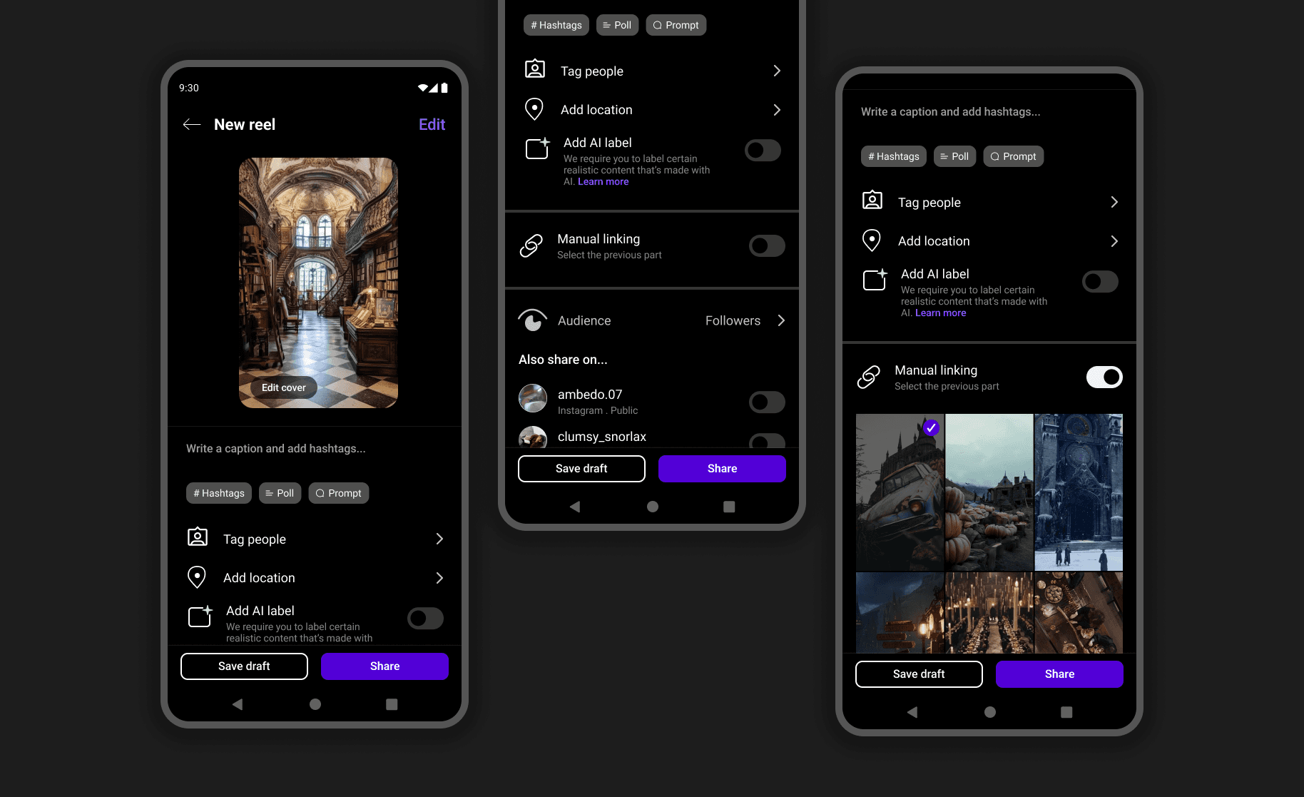
Enhanced metadata and navigation features that go beyond the caption. Incorporated new elements like Series Title and linked first part of the series.
Why it works?
Reduces dependency on captions and pinned comments
Creates clarity for viewers joining mid-series
Empowers creators to structure narrative arcs

Auto-link series
Manually searching for a reel to link to can be tedious for the creator in case of a series having many parts.
Auto-link series automatically adds the new reel to an ongoing series or gives the option to start a new series.

Viewer's flow
Linking of reels by the creator
Conclusion
Whether the multi-part reels culture started as a workaround for Instagram’s short-form limitations, or as an engagement bait to land more users on the creator’s profile... the idea quickly became a frustrating user experience—both for viewers struggling to find the next part and for creators unable to link related reels.
Iteration 1 made it easier to locate a Reel on a creator’s profile, and manually linking reels.
Iteration 2 introduced seamless navigation with manual and auto-linking, ensuring users could move effortlessly between parts.
